Very Peri Perks: A Look at Pantone Color of the Year 2022
Building custom furniture, we work with colors every day. Wood colors, stain colors and upholstery colors that enhance the look of each piece we build. Which is why we always have an interest in the Pantone Color of the Year and the perks it brings. Let’s take a look at the fresh new shade that’s being called confident, energetic and full of possibility.
What is Pantone Color of the Year 2022?
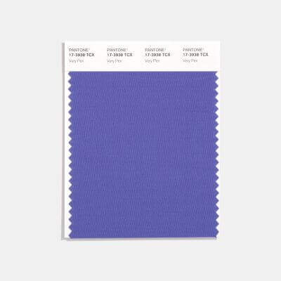
Photo Credit: www.pantone.com
The coveted spot this year as Pantone Color of the Year for 2022 is a shade called Very Peri, defined by Pantone as a dynamic periwinkle blue hue with vivifying red undertones.
The combination of this dynamic blue with energetic red creates a warm, yet strong shade. The unique mix represents creativity and possibility, themes many will warm to in response to the isolation of the past few years.
Very Peri is expressive in its unique combination of reliable blue and red pizzazz. While red brings energy and inspiration, blue lavender is calming and hopeful.
This transformative shade offers a parallel to the changes that have taken place globally. Emerging from isolation with energy and optimism, open to possibilities and newness, this pantone color of the year sets the stage for what’s ahead.
Ways to Communicate with Color
Color is a great communicator, allowing you to express ideas as you decorate. Here are a few suggestions for adding Very Peri or another color you love throughout your home.
Add color with new lighting.
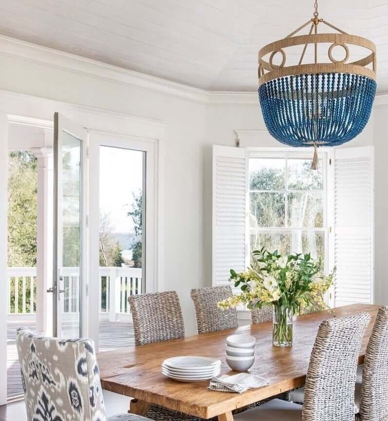
Add color with an accent chair or pillows.
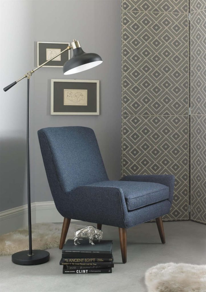
Add color with a sofa.
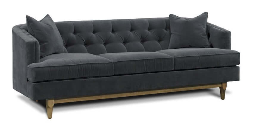
Other ways to infuse the color of the year include towels, accent pillows, coffee mugs or vases.
Pantone’s Color of the Year always attempts to reflect current sentiments. 2021 Pantone colors were Ultimate Gray and a yellow shade called Illuminating. They were meant to stand for hope and bright light ahead. Very Peri brings us out of the challenges of the last two years with something carrying new energy within its tones.
How do you feel about Pantone’s Color of the Year 2022, Very Peri?

 Samples
